


TL;DR: For months, every graphic I made with AI looked like it came from a different newsletter, because the tool forgets what it drew last week. The fix was a one-page spec it reads before drawing anything: a locked palette, fonts assigned to fixed jobs, and a target for how full the frame should be. Here it is, plus the two bugs that spec still missed on this very issue, and how to write your own tonight.
Every graphic was a stranger
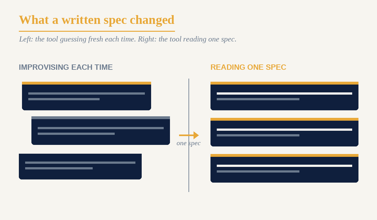
The ideas were fine. The pictures were a mess. I would ask for a chart on Monday and get a clean one, ask for its companion on Thursday and get a different blue, a heavier title font, a number stranded in empty space. Side by side, no one would guess they came from the same publication.
The tool does not remember Monday. Every request starts from nothing, so each graphic is a first draft by a designer who has never seen my work and has no house style of their own. Ask ten times, get ten sincere guesses, all competent, none matching.
The three rules that fixed it
I stopped describing what I wanted in the moment and wrote a standing spec the tool reads before it draws. Three rules carry most of the weight.
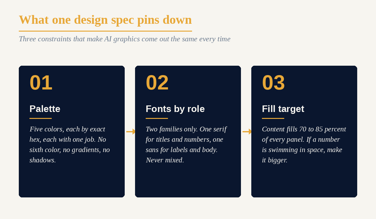
Palette. Five colors, each with its exact hex value and its one job: deep navy for backgrounds, warm amber for accents, and so on down to a near-black for inset panels. Then the line that does the work: use only these five, no gradients, no shadows. Left to improvise, AI reaches for a slightly different blue and a tasteful gradient every session. Naming the five and forbidding the rest ended that overnight.
Fonts by role. Two families, never more. One serif for titles and big numbers, one sans for labels and body, each assigned to a fixed job at a fixed size. A card heading looks the same whether it shipped in May or ships in September. Variety is the enemy of a brand.
Fill target. Content should fill 70 to 85 percent of a panel, and if a number is swimming in space, make it bigger. The tool had no opinion about how full a frame should feel, so I gave it one, as a ratio it can measure.
Design for the crop
My first header looked sharp in the design file and broke in the feed. I had set the title in a side panel, and Substack center-crops the image and re-renders the title itself, so my version got sliced off and the title printed twice. Now everything that has to survive lives in the center square, the middle 816 pixels, and the outer strips are bleed the crop can throw away. The version that counts is the one readers see, already cropped, so I check it there before it ships.
The rules catch known bugs; I catch the new ones
Almost every rule in that file started as a bug with a date on it: text floating too high in a panel, a label printed on top of a chart, a curve that shipped looking like a staircase. Each cost one redraw, then became a rule that catches it before the file saves.
A spec only knows the mistakes you have already made. Making the graphics for this very issue, two fresh ones slipped past it, and I caught them by reading the finished images back before you saw them. One diagram ran off the bottom of its frame, its labels sheared clean off the edge. A comparison card meant to show what inconsistency looks like used a stray orange that appears nowhere in my five colors, which is a different flavor of off-brand than I was going for. The tool reported success on both. Only a human looking at the actual pixels caught them.
So the division of labor is plain. I wrote the spec and I keep the taste. The tool runs the palette, the fonts, and the pixel math faster than I would at ten at night, and I read every image before it goes out, because it cannot see when something is ugly or sitting half off the frame. That part stays mine.
Here’s how you take action
If you make anything visual with AI more than once, stop tuning prompts one at a time and write the spec. One page does it.
Lock the palette by hex. Name four or five colors, each with its job, and add one instruction: use only these. AI invents a new near-match shade every session unless you close the door.
Give every font one job. Two typefaces at most, each assigned to a fixed use at a fixed size. Consistency is the same face in the same place every time.
Set how full the frame should be. A target like 70 to 85 percent beats “make it balanced,” because the tool can check a number and cannot check a vibe.
Read the finished file back before you ship, in the real place. The spec catches the bugs it already knows, and your own eyes catch the ones it has never seen. The tool will report success on a graphic running off the edge of the page.
Turn every new mistake into one line. Write the rule that prevents it, with the date, and add it to the spec. The document grows until the breaks stop.
The tool draws whatever I describe, forever, with no memory of yesterday and no taste of its own. The memory and the taste are the parts I supply, once in writing and once more with my own eyes before it ships. After that it keeps my house style better than I keep it myself.
If you are building a design system your AI tools have to follow, I would like to see the first rule you had to write twice: christina@workforcerewired.co
The Prompt Log is a recurring feature of Workforce Rewired. Published when there’s something honest to say about the process.
The views expressed here are my own and do not represent the position of my employer or any organization I am affiliated with.